Recently, I was pulled in to do some content QA on a project and while doing so, I realized the potential to streamline the process a bit. Currently, there are several existing tools that perform various site audits, but I wanted to create one that would be more integrated with the WordPress editing experience and deliver a way to view the specific data that we needed.
I imagined this tool being useful as a lightweight aggregation of several types of data, allowing the user to search for very specific conditions within their block layouts.
Some use cases are:
Find all instances of a specific block throughout the site and view information about that block.
Check to make sure certain block types are nested correctly within a specific parent block type.
Check to see if there are any empty blocks (list blocks with no content, etc.)
Check alt text on all image instances.
Check all links to see if they are external or pdf and not opening in a new tab and vice versa.
Quickly view all link texts to see if they are descriptive enough.
Check for all instances where headings are out of order.
The User Flow
This project includes a plugin and a separate visualizer app. I chose this setup to limit the database stress of the WordPress site by limiting the ability to audit and query the database to only logged-in admin users.
Explore various data, including flags (out of order headings, mismatching link targets, missing alt texts on all image instances, and empty blocks), all blocks, all links, and all pages.
I conveniently added links to both the published page and the editor for that page for each flag and block so that if the user discovers an issue, they can quickly enter the editor or view the issue.
Tour of the Visualizer
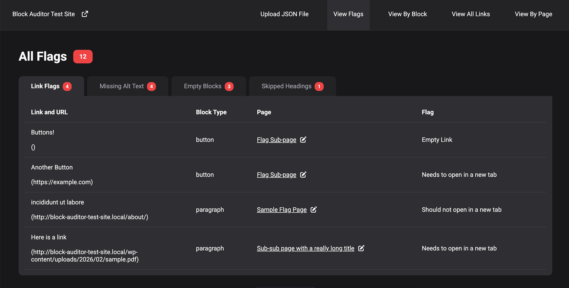
Flags View
Upon uploading your JSON file, you are automatically directed to the flag page, as those are the issues that will likely need to be taken care of.
The 4 major types of flags are links with empty href attributes or mismatching target attributes, missing alt text on images, empty blocks, and out-of-order headings.
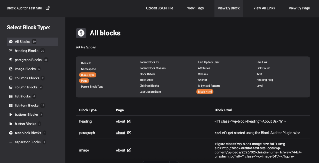
View By Block
In this view, you can view all blocks or just specific blocks and view whatever information about them you are interested in.
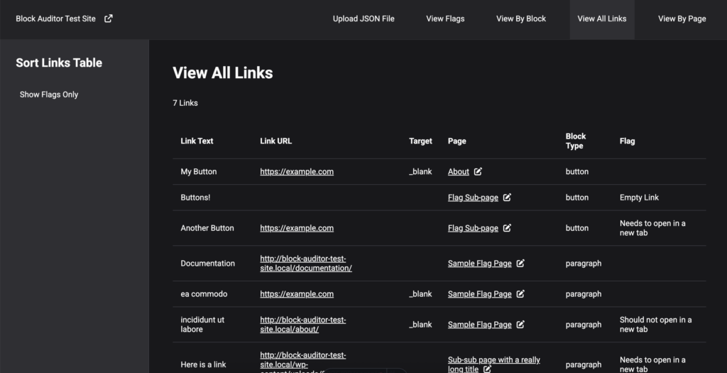
View All Links
This view aggregates all links on the site, shows their block type, url, target, page, text and if they are flagged with a potential issue.
This provides an easy way to make sure all links on your site are descriptive enough (no “Learn More”s!)
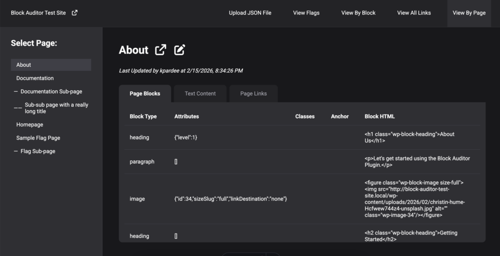
View By Page
This view shows the hierarchy of pages and three sets of information about each page: all blocks, just the text content (flagging any out-of-order-headings) and all the links on the page.
The Tech Stack
Plugin
The Block Auditor plugin is a lightweight PHP plugin that outputs JSON.
Visualizer App
The visualizer uses Astro for a framework with what is essentially a React SPA inside of it. Languages used are Typescript, HTML, Vanilla CSS. Deployed on Netlify via GitHub. All data-processing happens client-side.
Continue adding more custom attribute sorting for core Gutenberg blocks (defining attributes from the attributes object for each specific type of block)
Add more post types to the audit (currently only audits page post type).
Add actual download functionality to plugin (currently outputs to textarea element)
React is an extremely powerful tool for executing JavaScript in a more efficient way, while abstracting away repetitive scripting. React offers several hooks that allow its users to quickly spin up readable and maintainable code.
In this project, we will utilize the three most essential core hooks: useState(), useEffect(), and useRef() to build a simple mobile dropdown menu.
For our mobile menu component, we will be using three hooks. Let’s dive deeper into each of them below.
useState() manages state changes
Where we might normally store DOM elements in variables and add event listeners to manage state in vanilla JS, React abstracts away this process into a considerably simpler syntax.
It provides a variable to store the current state of a variable, and an updater function to update the state.
The syntax for useState() is shown below:
JavaScript
const[state,setState]=useState(initialState);
We use array deconstruction to name two variables that are returned from the useState() hook: our state variable, and our state updater function. We then set our initial state by passing a value to the useState() function.
To demonstrate how we can call the state updater function, let’s imagine in our return block of jsx, we have a button that will update the state when clicked or an input field that will update the state any time it is changed:
JavaScript
return (<buttononClick={()=>setState(2)}>Set to 2!</button>//Sets state to 2 any time it is clicked.<buttononClick={()=>setState(!state)}>Toggle State!</button>//Toggles state if using boolean values.<inputtype="text"value={state}onChange={(e)=>setState(e.target.value)}//Sets state to whatever the user inputs in the text field./>)
A quick note: Make sure you wrap your state updater function in a callback function if you are updating the state based on a previous value (like in the last example).
useEffect() manages side effects in a predictable way
Since React components are designed to be pure functions, useEffect() allows us to manage side effects in a way that is predictable. React can predictably handle anything within a component that deals only with itself, but when we need to interact with something outside of the scope of our component, we need to use useEffect() as a sort-of “messenger” to the “outside world.” This is because our side effect probably doesn’t need to be run every time its parent component re-renders (Like fetching from an API every time your component changes).
Let’s break down the syntax below:
JavaScript
useEffect(()=>{//Do something outside the scope of our component here://console.log(myState);//API fetching//DOM manipulationreturn()=>cleanupFunction();}, [myState])
useEffect() takes two arguments: a function and a dependency array. If the dependency array is empty, [], then the function will run only once when the component is first mounted, and never again unless the component unmounts and mounts again. The dependency array holds one or more state variables that trigger the useEffect() function to run every time their state changes.
The function should also return a cleanup function removing any event listeners to prevent duplicate event listeners being added each time the effect is run.
Note: If you don’t include the second argument at all (no brackets), then the function will rerun on every render, leading to unexpected results.
useRef() creates a persistent reference throughout the render cycle
In vanilla JS, we might assign a DOM element to a variable in order to do something with it, but using this method inside a React component can present some issues. Namely, the variable can only be defined once the element it’s assigned to is rendered. If the variable assignment happens before the element is mounted, it will be assigned undefined. React provides a way to not only solve that issue, but make references to the DOM more efficient.
useRef() holds the value of null until its reference element is mounted, so it won’t unexpectedly be undefined. useRef() also creates a persistent reference in React, meaning that it doesn’t trigger a re-render each time its reference is used (unlike assigning a variable directly to document.getElementById()). It also works within React’s Virtual DOM, making it way more efficient than dealing directly with the real DOM.
Are you sold? Let’s look at the syntax below:
JavaScript
constmyRef=useRef(null);//Initializes with null, later to be assigned to the DOM element. //...return (<pref={myRef}>My Paragraph Element</p>)
Mobile Menu Functionality
For our mobile menu, we want a button that will open and close the menu. We also want our user to be able to click outside of the open menu to close it as well (hint hint! We will be working with elements outside the scope of our component, so we will need useEffect!).
Where will our three React hooks come into play for this component?
We will use useState() to manage whether our menu should be open or not. We will use useEffect() to add an event listener in the document to track if a user clicks outside of the open menu (in order to then close the menu). We will use useRef() to assign a reference to our entire menu container (so that if the user clicks anywhere except the menu area, the open menu will be closed).
Complete Annotated Files
JSX
import{useState,useEffect,useRef}from"react";//Import our React HooksconstNavBar=()=>{//Define our dynamic menu itemsconstmenu= [{text:"Projects",link:"https://pelada.katiepardee.com"},{text:"Skills",link:"#skills"},{text:"Contact",link:"https://www.linkedin.com/in/katie-pardee-202b5b229/"} ]constmenuCont=useRef(null);//Add a reference to our menu containerconst[isMenuOpen,setIsMenuOpen]=useState(false);//Initialize our menu state//Define operations that will happen outside the scope of this componentuseEffect(()=>{consthandleClickOutside=(e)=>{//Handler Function for when a click is registered (see event listener)if (isMenuOpen&&!menuCont.current?.contains(e.target)) {//Check if the menu is open and the click was not inside the menusetIsMenuOpen(false);//Close menu if both conditions are true}}document.addEventListener('click',handleClickOutside);//When the effect is run, add an event listener to the documentreturn()=>{document.removeEventListener('click',handleClickOutside) //Cleanup function to avoid memory leaks}}, [isMenuOpen]);//Dependency array tells effect to run every time the isMenuOpen state changesreturn (<header><divref={menuCont}><divclassName="menu-bar"><h1>This Could Be Your Logo</h1><buttononClick={()=>{setIsMenuOpen(!isMenuOpen)}}>{/* Toggles the state of isMenuOpen */}<svg>Your SVG Here!</svg></button></div><navclassName="mobile-menu-parent"><ulid="mobile-menu"className={isMenuOpen?"open":""}>{/* If isMenuOpen is truthy, add class "open" */}{menu.map((item)=> ( //Map through our menu array to create list items<likey={item.text}><aclassName="menu-item"href={item.link}>{item.text}</a></li> ))}</ul></nav></div></header> )}exportdefaultNavBar;
I was approached by a member of the steering committee for the Corvallis Celtic Festival to create a website for them after their inaugural festival. They primarily needed an online presence for grant-writing, applications, and a way for festival attendees to get information.
“Katie developed a website for our organization that is clear, attractive, and functions beautifully. She has a knack for wading through a sea of vague ideas and finding a clear and effective solution. She was responsive to our needs and always delivered above and beyond our expectations.”
-Steering Committee Member
Project Overview
I came onto this project with a clean slate. They had a general idea of the content they wanted, but no existing website or organization emails set up and just a few branding items (including a logo). My job was to get them completely up and running.
Astro/Contentful Setup
The tech stack I used for this project was Astro.js for the frontend with Tailwind for styling and Contentful for the CMS. The frontend is deployed with Netlify and their business emails are hosted by Dreamhost.
Contentful CMS
For the CMS, I wanted something that was as intuitive as possible, as I would be handing off the editing largely to the client. I added about a dozen content types in Contentful that I predicted would be changed the most often, including events, performers, workshops, announcements, and more.
I also set up a preview method using Contentful’s Preview API so that the client can view edits before they publish. I set up a webhook to automatically deploy to Netlify when content is published or unpublished and another webhook via Zapier to notify me when this happens, so that I can ensure everything goes smoothly.
Astro Frontend
I used Astro to build the frontend, as it is a fast static site framework with tons of flexibility. The dynamic data fetched from Contentful is included in each build, though any images from Contenful remain delivered by Contentful’s CDN. The page load speed is still quite fast, even though these assets are not built in to the static page.
Custom Forms
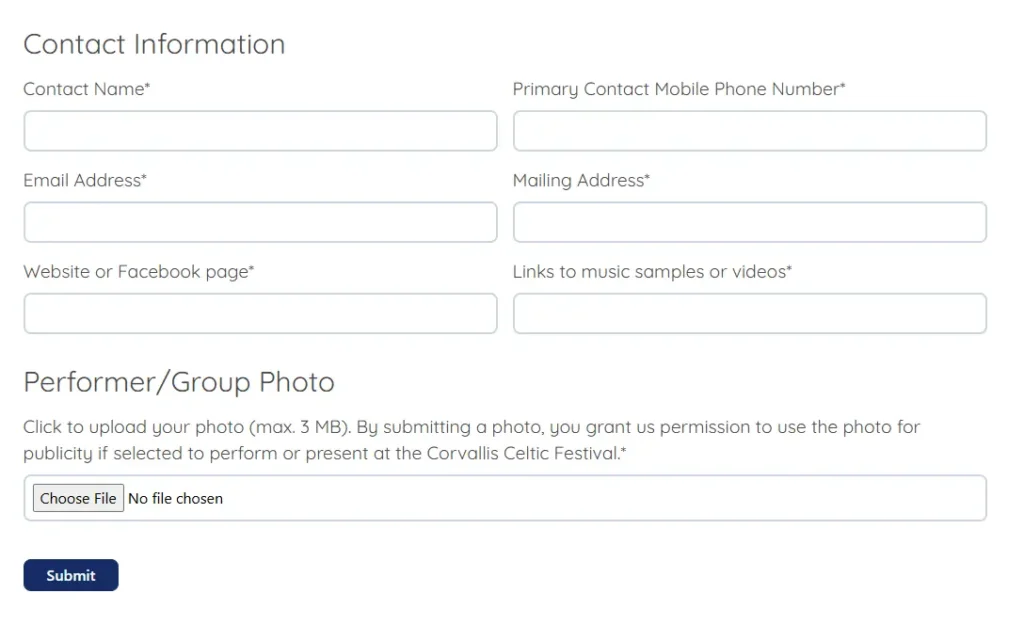
CCF required several custom forms – a dynamic contact form (that submits form notifications based on a dropdown field), a performer application, a vendor application, and a festival survey.
I used a combination of tools to make these forms, including HTML form structure, JavaScript file validation logic, and Zapier notification routing.
Other Project Components
After building the frontend and integrating the CMS, I added a few more bells and whistles.
Mailchimp Integration
I set up a Mailchimp account for CCF and trained a committee member on how to navigate the dashboard and send campaign emails. I then added a mailing list sign-up form to their site.
Email Routing
I set up @corvalliscelticfestival.org emails for several positions within the organization and routed the emails to the correct individuals.
Client Collaboration
This project required working closely with members of the steering committee to ensure the delivered website was aligned with their goals.
Planning and Revisions
During the initial planning state, I worked with several committee members to produce a general layout. Once I had an initial design, it then went through content and layout revisions, until we reached a consensus.
CMS Training
Once the CMS structuring was in place, I met with two committee members to train them how to use the CMS and brought printed custom instructions for how to do so. I remain available to answer any question they have and monitor any updates that go through.
For this project, I wanted to be able to add a custom tooltip to a range of text in the rich text editor. The tooltip would need to have a unique text that the user could input, so that the format could be used multiple times throughout the page.
This was my first time adding a custom button to the rich text formatting toolbar. It is a lighter weight alternative to registering an entire new block, and offers an intuitive way for editors to add inline formatting.
I spent a lot of time exploring and learning for this project, and if this is your first time creating a custom formatting button, I would suggest you do the same! Start simple, then slowly add functionality. Make mistakes, and figure out why what you’re doing isn’t working. This is the best way to understand why something IS working when it does!
To-Dos
Add a button to the format toolbar
Create a pop-up for user input anchored to selected text range
Pass dynamic tooltip text into CSS for use in a psuedoelement
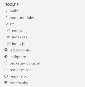
I started by running npx @wordpress/create-block@latest, even though it scaffolds much more than we need for just adding a format button. Then I went ahead and altered the files and structure to be only what I needed. In the src folder, I only kept the edit.js, index.css, and index.js files. We can clear out their boilerplate code since we will be registering a format button instead of a block.
Here is some more information about these files:
plugin.php
The boilerplate php file in the root directory that enqueues the plugin is initially set up for a full custom block. We aren’t registering a block, but just enqueuing our asset files.
index.js
This file is responsible for registering the format type. Similar to registering a block, it uses the function registerFormatType() and takes two arguments: ‘namespace/format-type’ and a configuration object.
edit.js
The edit file contains the exportable Edit() component. Unlike the block scaffolding, we will not use the { attributes, useAttributes } parameter. Instead, the Format API defines a parameter object with three variables for us to use: value, onChange, and isActive.
index.css
The edit file contains the exportable Edit() component. Unlike the block scaffolding, we will not use the { attributes, useAttributes } parameter. Instead, the Format API defines a parameter object with three variables for us to use: value, onChange, and isActive.
User Flow
Once we have our files set up and ready to go, it is helpful to imagine yourself as the user to conceptualize what using the button would be like. For this custom tooltip button, I wanted to have the following user flow and functionality:
User highlights an existing portion of rich text to be used as a trigger text.
Editor displays rich text formatting toolbar.
User clicks the tooltip format button.
Editordisplays a popover with an input field and an apply button.
User enters their tooltip text and clicks ‘Apply’.
The tooltip text will now appear when the user hovers over the trigger text.
If the user clicks anywhere within the applied formatting range, the popover will appear again with the current tooltip text already in the input field. The user can either alter the text and apply again or delete the tooltip formatting.
Core Logic
Now, let’s get more specific about how the functionality of that user flow will work.
Display a button in the rich text toolbar
To simply add a button to the toolbar, we return the RichTextToolbarButton component in our Edit function. In our index.js file, we use registerFormatType() instead of registering a block. registerFormatType() takes two arguments: the unique name of the format, and the configuration object.
Use the highlighted text as an anchor
Using window.getSelection() and getBoundingClientRect(), we can create an anchor to visually place the dialogue box directly beneath the highlighted text and the useState() hook to keep track of the state of the anchor for when the user selects a different range of rich text.
Display pop-up dialogue when clicked
We can use the useState() hook to store whether the Popover component is visible or not.
Store the user-input when the apply button is clicked
We can use the useState() hook to store the value of the TextControl component’s input field and set the state using the apply button onClick attribute.
Apply the user-input value to CSS psuedoelement
By altering the user-input to create a html-safe unique class and adding a data attribute containing the user-input, we can dynamically display the user-input content for each tooltip format in the post.
Complete Annotated Files
Below I have annotated some of the finished files for this plugin. In the src folder, we have edit.js, index,js, and index.css and in the root directory we have tooltip.php.
edit.js
import{__}from'@wordpress/i18n';//The syntax that allows WordPress to translate text to other languages.import{RichTextToolbarButton}from'@wordpress/block-editor';//The button that will appear in the toolbar.import{applyFormat,removeFormat}from'@wordpress/rich-text';//Applies and removes our custom format.import{Popover,TextControl}from'@wordpress/components';//The components that will pop up for user input.import{useState}from'@wordpress/element';//React useState() hook for managing state.import'./index.css';//Our css styling for our format and editor UI.//Below is our Edit function declaration with the necessary parameter object.exportdefaultfunctionEdit({isActive,onChange,value}){const[isVisible,setIsVisible]=useState(false);//To manage our popover visibility.const[tooltipText,setTooltipText]=useState('');//To manage the content of the tooltip text.const[anchor,setAnchor]=useState(null);//To manage where the popover will appear.consttooltipClass=tooltipText.replace(/[^a-zA-Z]/g,'');//To create an HTML-safe unique class name.//Below is our handler for applying the format to the selected text.consthandleApply=()=>{onChange(applyFormat( value,{//Applies the format specified to the selected range.type:'tooltip/tooltip',attributes:{'data-tooltip':tooltipText,//Adds a custom HTML data attribute so we can use it in our CSS.className:tooltipClass}}) );setIsVisible(false);//Once we click Apply, we want the popover to disappear.}//Below is our handler for removing the format from the selected text.consthandleRemove=()=>{onChange(removeFormat( value,'tooltip/tooltip') //Removes the format. );setTooltipText('');//Resets the state to an empty string.setIsVisible(false);//Hides the popover.}//Below is the handler function for when we click on the format button in the toolbar.consthandleClick=()=>{letselectedText=window.getSelection();//Returns a selection object which includes info about the selection node and its offest within that node.if (selectedText.rangeCount>0) {//Only executes if selection is not collapsed.constrange=selectedText.getRangeAt(0);//Stores the entire range as a Range object in variable range.constrect=range.getBoundingClientRect();//Returns the size and position of a rectangle.setAnchor({//Our state updating function for our anchor state. We will pass in a VirtualElement object.getBoundingClientRect:()=>rect,//Visual positioning.ownerDocument:document//Top level document of our node.});//Read more about the VirtualElement object in the Popover Component documentation.//Since our formats are not kept via a save function and instead stored inline in the HTML, //each time we want to access our tooltipText, we will need to set a new tooltipText state. //We need to find the existing tooltip text in the selection's data-tooltip attribute, //then use our state updater function, setTooltipText, to get it to display in our input field for editability.if (isActive) {//If selection has an active format, find the tooltipText state and add to input field.constactiveFormat=value.formats[value.end]?.find( //Find the format at the end of the selection.(format)=>format.type==='tooltip/tooltip'//If that format is our custom format, store in activeFormat. );//Read about the Value object in the docs. See Resources at the beginning of this post.if (activeFormat) {setTooltipText(activeFormat.attributes['data-tooltip']);//Set the tooltipText to the existing data-* attribute.}}setIsVisible(true);//Displays the Popover.}}return (<><RichTextToolbarButton//Gutenberg component for a rich text toolbar button.icon='info'title={__('Tooltip Text','tooltip')}//Translatable button title that will appear in the toolbar.onClick={handleClick}//Calls the handleClick function.isActive={isActive}//Determines if the button is highlighted when a format is applied./>{isVisible&& ( //Only displays if isVisible's state is true.<Popover//Gutenberg component similar to a modal.className='popover'//Added a class name for styling the popover.anchor={anchor}//The popover will be anchored to the value stored in the anchor state.><TextControl//Gutenberg text input field component.className='text-control'//Class for styling.label={__('Tooltip Text','tooltip')}//Translatable label for text input field.value={tooltipText}//Value set to what is stored in the tooltipText state.onChange={(val)=>setTooltipText(val)}//Callback function to update state as you type.help={__('Enter tooltip text here.','tooltip')}//Translatable help text.hideLabelFromVision//I wanted to display the help text, but not the label. Just a style choice./><divclassName="pop-but-cont"><buttononClick={handleApply}>Apply Tooltip</button><buttononClick={handleRemove}>Remove Tooltip</button></div></Popover> )}</> );}
index.js
import{registerFormatType}from'@wordpress/rich-text';//Gutenberg function to register a format type.import'./index.css';//Import our css styling.importEditfrom'./edit';//Import our Edit function.registerFormatType( 'tooltip/tooltip',{//First argument registers the name of the plugin. Then our config object.title:'Tooltip Button',tagName:'span',//The type of tag that will wrap the selected rich text in order to apply the format.className:'trigger-text',//The styling for the format.edit:Edit,//Provides instructions for how our button should behave.} );
index.css
.trigger-text{position:relative;/*We want to position our tooltip relative to the trigger text.*/box-sizing:border-box;font-weight:bold;}.trigger-text::before,.trigger-text::after{/*Pseudoelements for the tooltip text and the triangle.*/position:absolute;/*Take the tooltip out of the flow of the document.*/left:50%;/*Position it 50% of the width of the parent away from the left bound of the parent.*/opacity:0;/*Set initial opacity to 0.*/transition:opacity 300msease;/*Create a smooth transition into view.*/z-index:10;/*Ensure tooltip is placed on top of the other elements.*/}.trigger-text::before{content:"";/*Empty content for now, but will be dynamically filled in later.*/width:200px;/*Must define a width so we can center it.*/background-color:var(--wp--preset--color--contrast);/*Use a wordpress-defined theme variable for color.*/color:var(--wp--preset--color--base);/*Same as above; this changes when you change theme colors.*/bottom:calc(100%+10px);/*Position tooltip text 100% + 10px up from the bottom of the parent element.*/transform:translateX(-105px);/*Adjust the positioning to account for half of the width + left padding.*/text-align:center;padding:5px;border-radius:10px;pointer-events:none;/*Ensures the tooltip's opacity only gets set to 1 while hovering the trigger text.*/font-size:var(--wp--preset--font-size--small);/*Wordpress variable for font size.*/line-height:1.25;}/*Below is a trick for creating a triangle pointer by using border widths, since each border creates a polygon.*//*You can google this - it is a pretty common trick.*/.trigger-text::after{content:"";border:solid6px;border-color:var(--wp--preset--color--contrast)transparenttransparenttransparent;transform:translateX(-3px);bottom:100%;height:0px;width:0px;}.trigger-text:hover::before,.trigger-text:hover::after{opacity:1;/*Display tooltip text and triangle on hover.*/}.text-control{/*Styling for TextControl input field.*/width:200px;padding:10px;}.pop-but-cont{/*Styling for buttons in Popover*/display:flex;padding:5px;}/*Here, we dynamically set the tooltip text by using a data-* attribute.*//*We add this css property to a class we dynamically create in our edit.js file.*/[data-tooltip]::before{content:attr(data-tooltip);}
tooltip.php
<?php/** * Plugin Name: Tooltip Button * Description: Adds an inline tooltip. * Version: 1.0 * Author: Katie Pardee * Text Domain: tooltip */functiontooltip_enqueue_assets(){wp_enqueue_script(//Specifies the javascript files to enqueue.'tooltip-editor-scripts',//Unique name for this asset. plugins_url('build/index.js',__FILE__),//Location of the file relative to plugin.['wp-rich-text','wp-block-editor','wp-element','wp-i18n']//Dependancy array.);wp_enqueue_style(//Specifies the CSS files to enqueue.'tooltip-editor-styles',//Unique name for this asset. plugins_url('build/index.css',__FILE__)//Location relative to plugin.);}//Tells wordpress to run our enqueuing functions for our plugin when it runs the enqueuing function for the rest of the blocks.add_action('enqueue_block_assets','tooltip_enqueue_assets');

